
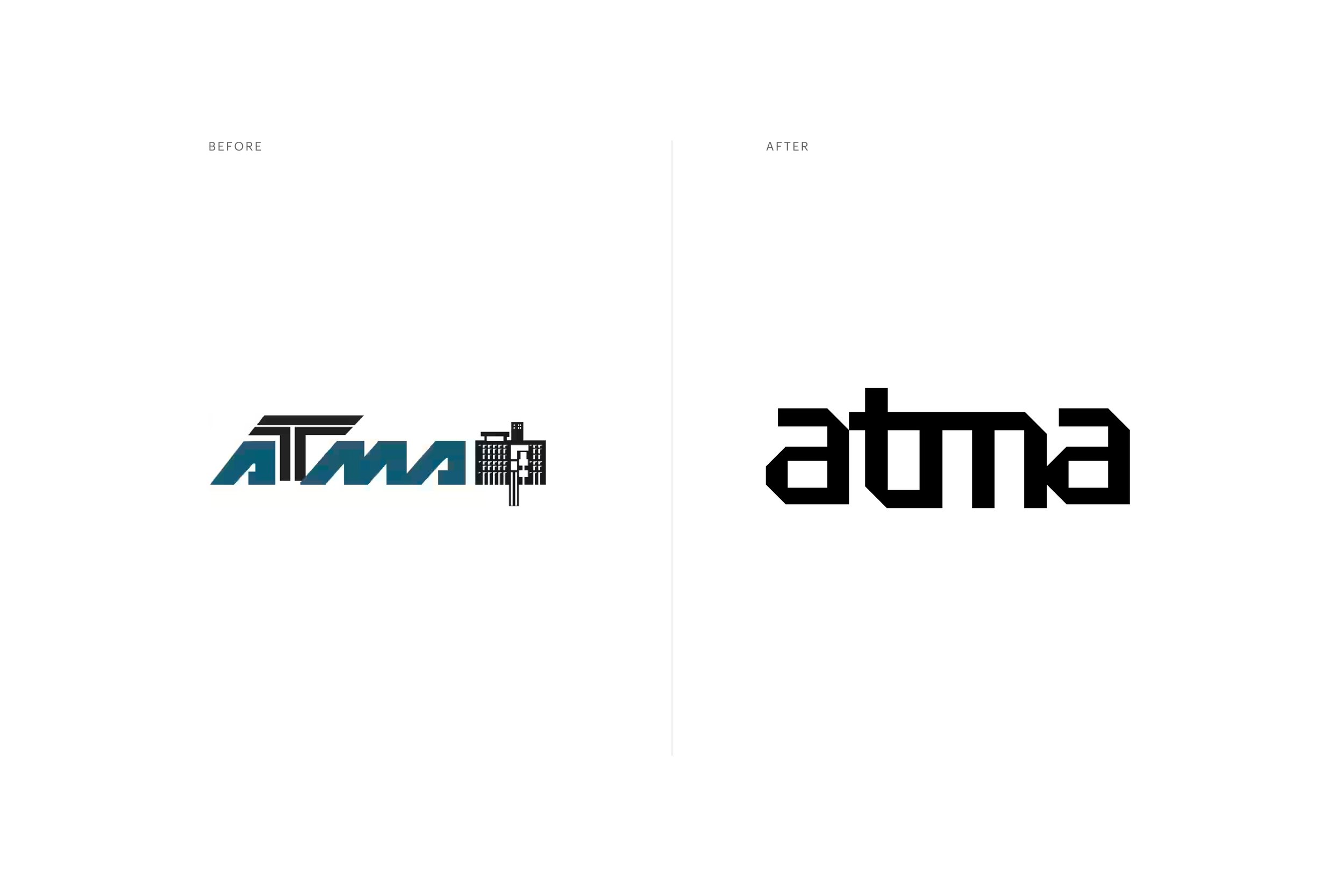
ATMA
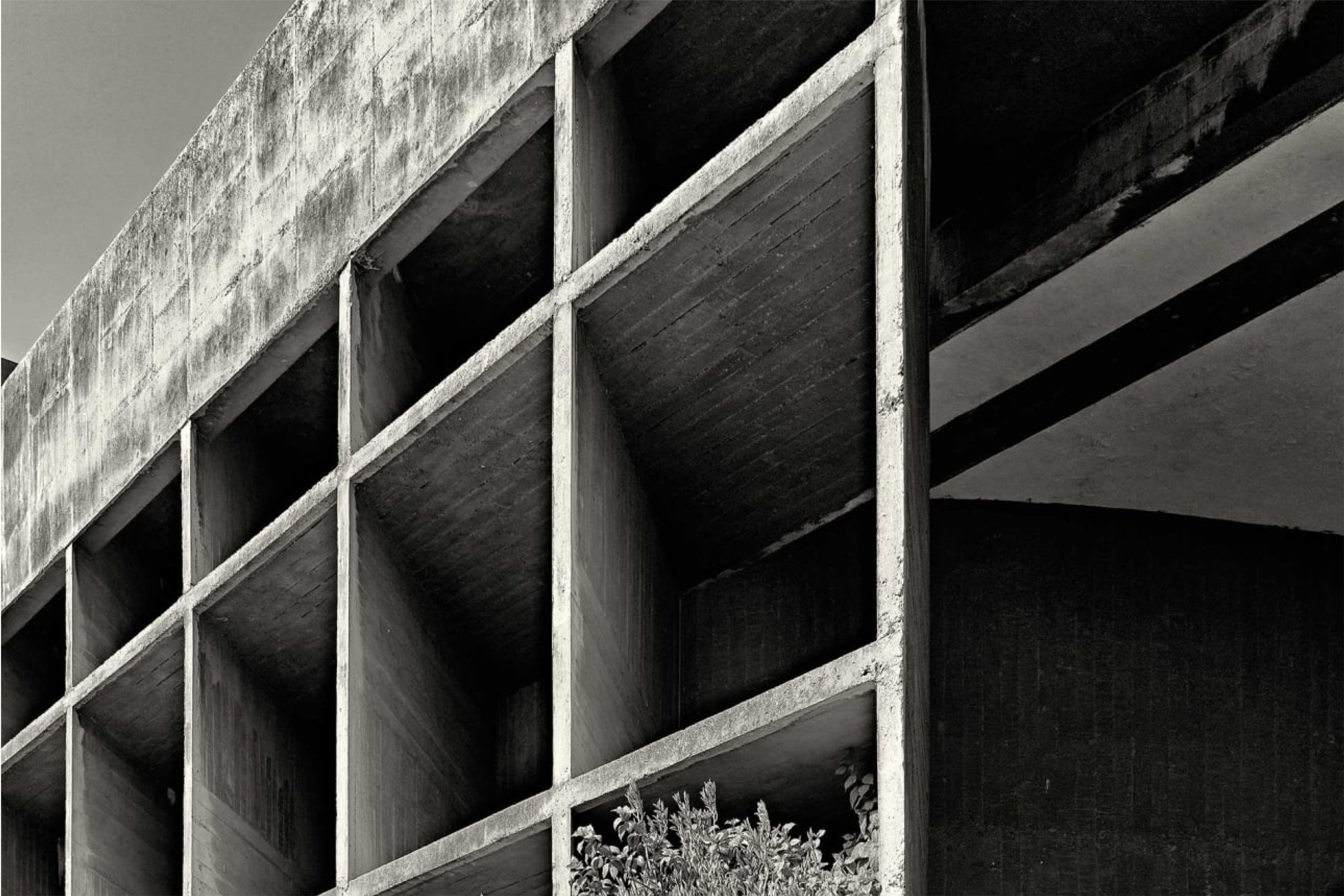
Growing up in Ahmedabad, I had the opportunity to witness the brilliance of architecture designed by Le Corbusier and B.V. Doshi. One such masterpiece is the ATMA House. The open fenestrations not only blur the boundaries of inside versus outside but also embody a quintessentially Indian value of openness—"open to receive anyone who comes in, whether it is people or birds."
Drawing inspiration from the city's built environment and my personal experiences, I embarked on a speculative brand identity exercise that pays homage to the ATMA House. My goal was to incorporate the Indian values of openness and to play with the building's visual language and form.
Inspired by the inviting open fenestrations and the shadow play they create, I decided to focus the identity system around these perspective frames. Each opening appeared as a separate frame or viewfinder, and when the sunlight hits the building, it casts shadows on the sun breakers at different angles, giving the appearance of perspective. I wanted to draw attention to these unique features and used a typeface whose deep cuts at the joints resemble the sharp, angular windows of the building structure.
For the mini publication, I chose a long accordion-fold format with hand-cut openings to highlight the building's unique features. Through this exploratory exercise, I aimed to capture the essence of the ATMA House and its role in embodying the Indian values of openness and hospitality.
-
M.Des. Graduate Student at Emily Carr University of Art + Design
-
Brand Design, Publication Design
-
2019 | 1 month


Related projects

Repurposing campus waste into sustainable stationery with The Stationery Project

Publication design documenting Amsterdam’s dual brand identities